Cover Design
By Darius
Ask yourself this question – Ready?
“Which is more important – the wonderful words you so lovingly crafted in your book – or the cover?”
Let’s look at eBook first. Your cover is the first thing that your potential reader sees when browsing a collection digitally. It MUST be thought of in terms of how it looks on a thumbnail in addition to its full size. Readers do judge a book by its cover, even in the digital world. Your cover is the first hook to attract a potential reader. It MUST stand out from the crowd.

As you have spent so much time and effort crafting your amazing book so you must do the same for your cover. It’s critical to your success and maybe even more critical than for a print book. If your shop window is Amazon you are jostling for position with millions of other would-be writers – far more than in a high street book store so (I’ve said it before and I’ll say it again) STAND OUT FROM THE CROWD.
When a customer picks up a conventional book they have the opportunity to weigh it up, to feel it, to check the blurb on the back, admire the soft caress of the pages, to hold your missive in their hands. A ‘physical’ book is part of an experience in the multi-coloured circus that is the bookstore where different styles and titles vie to catch the customer’s eye. Your digital cover is out there for all to see yet it is all alone on the digital page. Your job is to make your customer care about it and in so doing care about you. Indeed it’s the start of a love affair in which the aim is to get this stranger to walk out with you – to take you – in the form of your book - home with them.
As an indie author you have one HUGE advantage over mainstream publishers.
“Oh yeah and what’s that?” I hear you cry.
The answer is simple – if you want to change your cover you can do it with a few clicks of the mouse and ‘hey presto’ (or ‘abracadabra’ if you prefer) you have rebranded your work. You can’t do that if there are five thousand copies sitting in the warehouse of a big publisher! So don’t just create a cover and then forget it. Keep an eye on the competition. Check what’s selling, what’s ‘hot’. Compare and contrast your cover with others. Never, ever become complacent.
I have heard indie writers say “I only wrote the book for me.” Sorry but that’s bovine faeces to my mind. If you wrote it for yourself you could have saved all the trouble and pain and just kept it in your head. You write so as others can share your world. Your cover must encourage readers to do the same. Treat your cover with the respect it deserves and your readership will grow. The most important person in the life of a writer, indie or otherwise, is the reader.
OK – back to the original question - “Which is more important – the wonderful words you so lovingly crafted in your book – or the cover?” If you answered correctly you’d have said “Both.” Best wishes and “Keep true to your calling.”
COVER DESIGN TIPS
Establish the REASON for the cover—Nothing is more important. Your book is about something, so SHOW it – or HINT at it BUT MAKE IT SPECIAL and DON’T fall into the trap of loading up your cover with too many elements. KEEP IT SIMPLE and PERTINANT.
You could think of your book cover like something seen from a train as your potential buyer walks by and sees it as a ‘FLASH’. The trick is to get them to stop, walk back and LOOK AT IT PROPERLY. And in those few seconds you must tell the reader the genre of your book, the general subject matter or focus, and some idea of the tone or “ambiance” of the book.
Make everything count— Find images that work without being too obvious. Look for something that expresses the mood, historical period, or overall tone of the book.
Keep the colours simple - it’s a BOOK COVER NOT A PAINTING.
Use the background—Avoid white backgrounds, which will disappear on retailer’s white screens. Use a colour, a texture, or a background illustration instead.
Make your TITLE LARGE and your name small. It’s the book they are buying not your name (even though your granny would like to concentrate on your name!) Reduce your cover design on screen to the size of a thumbnail on Amazon and see if you can read it (100 x 160 pixels). Can you make out what it’s about? If not, simplify.
Use a font that’s easy to read. There’s no sense using a font that’s unreadable when it’s reduced. Particularly watch out for script typefaces, sometimes curvyliscious fonts (I just made that word up!) look good in isolation but are often illegible on the front cover.
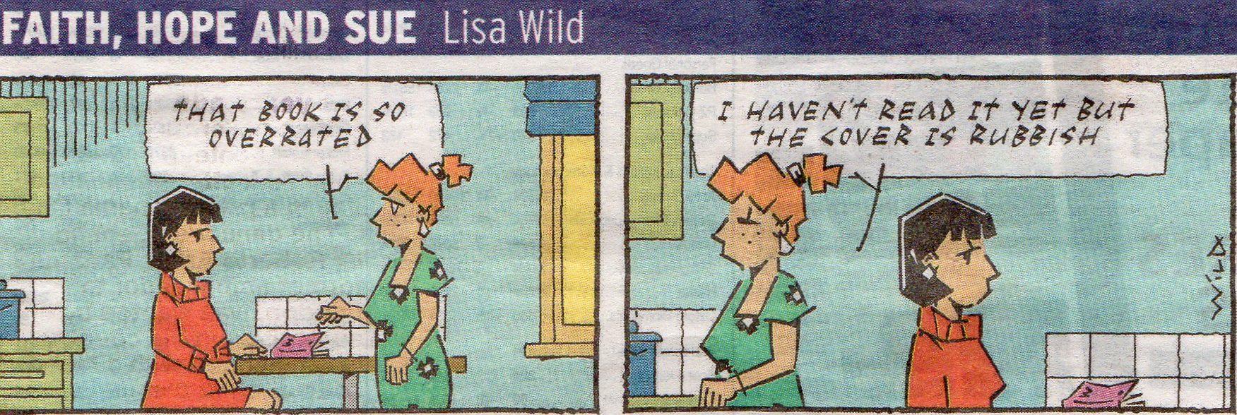
And finally – it’s true – Joe Public does judge your book by its cover.
Have a look at this external link for some examples from XinXii's blog.
